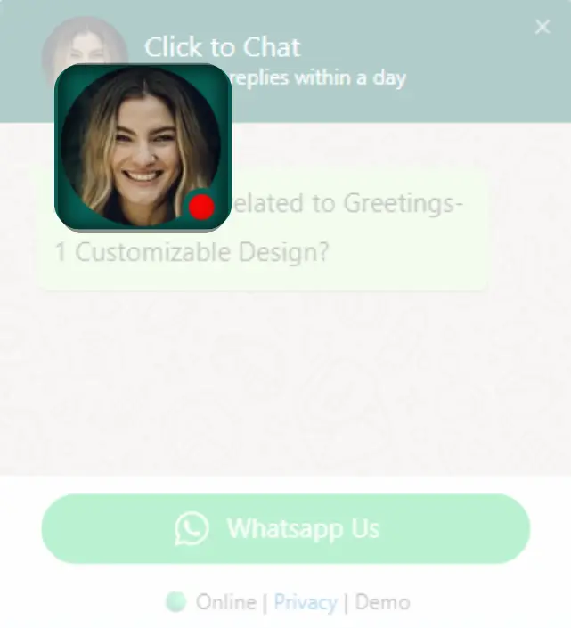
Every Greeting Element, Perfectly Crafted
Break your greeting dialog into flexible, customizable components – each designed for complete visual and functional control.
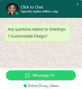
Header Content (Title & Intro)
Customize the greeting header with your brand colors, logo, and introductory message to create a strong first impression and build trust instantly.
Main Content (Core Message)
The core message area where you guide visitors using clear, engaging text, emojis, and interactive elements to enhance communication.
Call-to-Action & Bottom Content
Drive action with fully customizable call-to-action buttons. Control button styles, text, and behavior to maximize engagement and conversions.
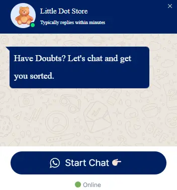
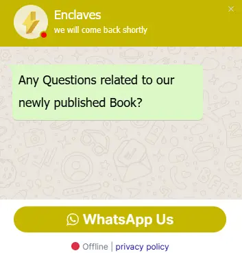
Smart Status Indicators
Automatically show online or offline status to set clear expectations and build user trust.
Online Status
Show when your team is available using real-time status indicators and personalized avatars.
Offline Status
Display offline messages, alternate actions, or fallback contact options when your team is unavailable.
Smart Trigger Actions (Pro)
Launch your greeting dialogs at the perfect moment with intelligent trigger systems. Choose from time-based, scroll, click, or viewport triggers for maximum engagement.
View PricingTime-Based Trigger
Automatically display the greeting dialog after a specified time delay. Perfect for giving users time to explore before offering assistance.
- Customizable delay
- One-time or recurring display
- User session awareness
Scroll Trigger
Trigger the greeting when users scroll a certain percentage of the page. Ideal for engaging users who show interest by scrolling.
- Percentage-based activation
- Scroll direction awareness
- Mobile-optimized detection
Click Trigger
Launch the greeting when users click specific elements like buttons, links, or images. Perfect for contextual help and targeted assistance.
- Multiple element targeting
- CSS selector support
- Event delegation handling
Viewport Trigger
Display the greetings dialog when specific content enters the user’s viewport. Great for section-specific assistance and progressive disclosure.
- Viewport visibility detection
- Threshold customization
- Multiple viewport zones
Endless Customization
Make every greeting truly yours with flexible colors, sizes, and placement options.
🎨 Color Variations
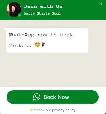
📐 Size Settings
📍 Dialog Placement
Explore Other Greeting Types
Choose from our complete collection of greeting widgets, each designed for specific use cases and business needs.
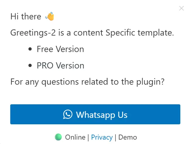
Content-Specific Greetings
Create dynamic greetings that respond to what users are exploring with intelligent content-aware messaging.
View Content-Specific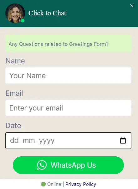
Greetings Form
Capture visitor information directly through interactive greeting forms with built-in lead capture and validation.
View Greetings Form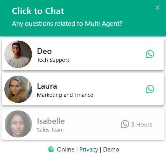
Multi Agent
Connect visitors to different team members with multiple agent profiles and department-based routing.
View Multi Agent🚀 Start Greeting Your Customers Today
Trusted by 700,000+ WordPress sites worldwide to boost engagement and conversions.