Capture Leads with
Greetings Form
Collect visitor details before they start chatting. Qualify inquiries, reduce spam, and improve response efficiency instantly.
Why Use Greeting Forms?
Collect meaningful information before chat starts and deliver more personalized WhatsApp conversations.
Lead Capture Made Easy
Ask the right questions before chat begins and receive visitor details directly in WhatsApp.
Instant Qualification
Convert visitors into leads immediately with interactive forms that encourage participation and build connections.
Start Every Chat with Context
Gather qualified leads with structured forms that pre-fill WhatsApp messages with visitor details for personalized conversations.
Flexible Fields for Smarter Conversations
Build fully customized lead forms tailored to your business goals.
Text Field
Capture names or short text responses with validation and placeholders.
- Single-line input
- Custom validation
- Placeholder support
Email Field
Collect verified email addresses with built-in format validation.
- Email validation
- Mobile-optimized keyboard
- Error prevention
Textarea Field
Allow visitors to share detailed messages or requirements.
- Multi-line input
- Great for inquiries
- Auto-resize support
Checkbox Field
Collect consent, preferences, or confirmations.
- Yes / No values
- Required option
- Privacy consent
Select Field
Dropdown field for services, categories, or options.
- Multiple options
- Custom values
- Clean UI
Phone Number Field
International phone input with country code detection.
- Country code selector
- Number validation
- Auto formatting
Date Field
Useful for bookings, appointments, and scheduling.
- Date picker UI
- Min / max limits
- Date with time slots
Hidden Field
Pass tracking data silently into WhatsApp messages.
- Invisible to users
- UTM & page data
- Analytics friendly
Greetings Form Builder
Build powerful greeting forms with 8 types of input fields. Configure and customize each field.
Greetings Form
📋 Demo Interface – Actual UI vary in product. Know more about Greetings Form
Preview
(This is Demo, Real Interface Is Different)
Engage Users at the Right Moment
Trigger greeting dialogs smartly – by time, scroll, click, or viewport – for better engagement.
View PricingTime-Based Trigger
Automatically display the greeting after a specified time delay. Perfect for giving users time to explore before offering assistance.
- Customizable delay (1-60 seconds)
- One-time or recurring display
- User session awareness
Scroll Trigger
Trigger the greeting when users scroll a certain percentage of the page. Ideal for engaging users who show interest by scrolling.
- Percentage-based activation
- Scroll direction awareness
- Mobile-optimized detection
Click Trigger
Launch the greeting when users click specific elements like buttons, links, or images. Perfect for contextual help and targeted assistance.
- Multiple element targeting
- CSS selector support
- Event delegation handling
Viewport Trigger
Display the greeting when specific content enters the user’s viewport. Great for section-specific assistance and progressive disclosure.
- Intersection Observer API
- Threshold customization
- Multiple viewport zones
📐 Make It Fit Your Website Perfectly
🎨 Customize the Look to Match Your Brand
💬 Place It Where It Converts Best
Choose how your greeting forms appear to users. Position them strategically for maximum engagement and user experience.
Corner Placement
Positioned next to chat button in bottom corner
Modal Overlay
Centered modal-style overlay
Form Use Cases
Discover how greeting forms can transform your business interactions and boost customer engagement across different scenarios.
E-commerce Support
Capture product inquiries, size questions, and purchase assistance requests directly from your product pages.
- Product-specific questions
- Size and availability checks
- Purchase assistance
Service Business
Collect service requests, appointment bookings, and consultation inquiries with detailed customer information.
- Service type selection
- Preferred appointment times
- Budget and requirements
Education & Training
Gather course inquiries, enrollment information, and student support requests with structured forms.
- Course interest tracking
- Enrollment applications
- Student support tickets
Healthcare & Wellness
Streamline patient inquiries, appointment requests, and health consultations with HIPAA-compliant forms.
- Appointment scheduling
- Symptom pre-screening
- Insurance verification
Explore More Greeting Types
Choose the greeting style that fits your business needs.
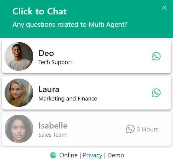
Multi Agent
PRORoute chats to the right team member automatically.
Explore Pro Feature🚀Start Converting Visitors into Customers Today
Join 700,000+ of businesses already using greeting forms to boost conversions and engage visitors.
Available in Click to Chat Pro. Compare plans →