The Click-to-Chat plugin offers 8 predefined button styles, with the option to upload your own custom image or GIF.
Every style in Click To Chat Plugin is customizable
Navigate to ‘Click to Chat’ -> ‘Customize‘
Customization Options:
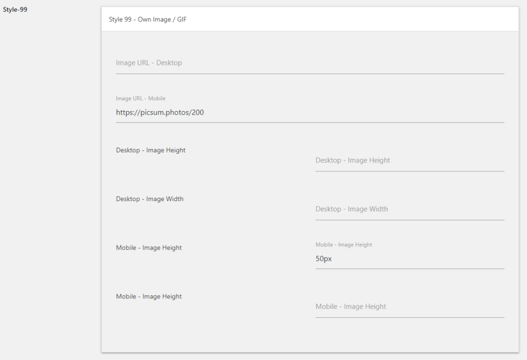
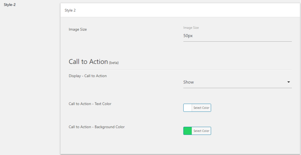
Style 2, Style 3, Style 99: You can adjust the image size for these styles to suit your preferences.
Style 7: The icon in this style is fully customizable. Adjust the border padding to create different shapes, such as round, square, or oval.
Style-7
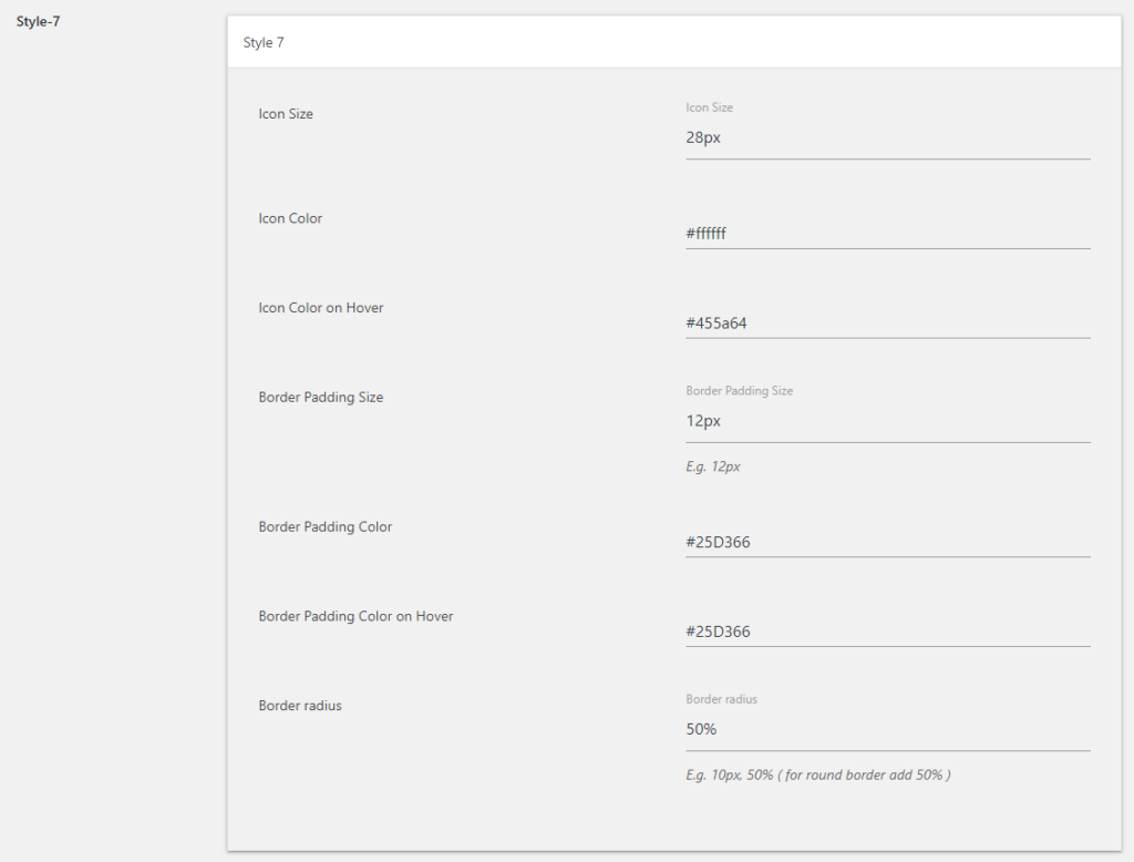
To achieve a curved border, simply modify the
border-radius property (e.g., border-radius: 12px).
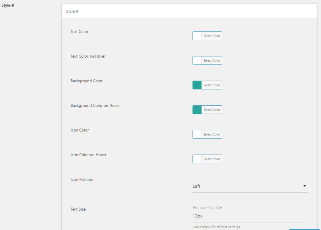
Style 4 & Style 8: These button and chip styles allow customization of background colors, text colors, and hover effects, giving you the flexibility to match your brand’s design.
Style-4
Style-8
Style 99: You can upload your own image or GIF for this style. If no image is provided, a fallback image will be displayed by default.